
Oshin Electrical branding and design
New logo design, identity and branding package for an electrician in South Wales
Branding package
The Story
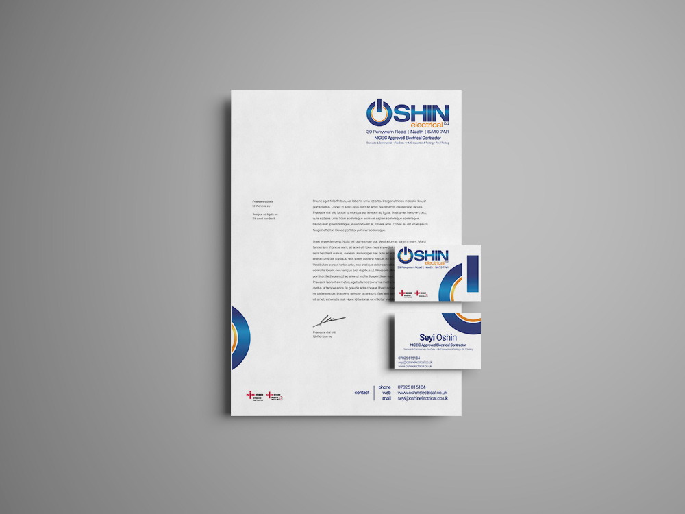
With a new name Oshin Electrical needed a new look to go with it. Seyi from Oshin Electrical originally requested a logo revision with a simple name change, but it was felt to be an ideal opportunity for a fresh new look, however for both continuity as well as his preference the blue and orange colour was to stay.
The Objectives
⬤ New logo using blue & orange with a gradient
⬤ Business card and letter head.
The Result
Mostly a simple but bold logotype with quite a subtle gradient, the universally known on/off icon may seem a little cliché but can work on its own either as a profile image for social media or as a feature across the business card and letterhead as shown left.
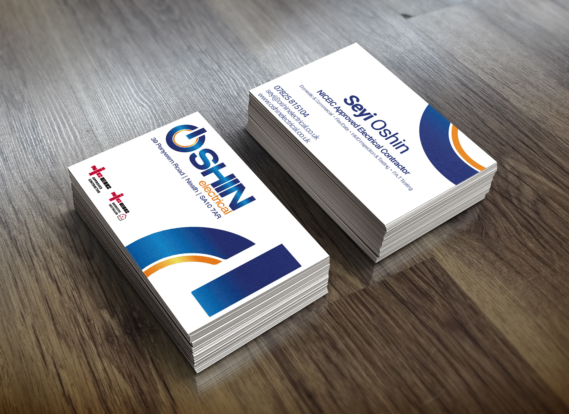
Oshin Electrical business cards