Swansea bar brand refresh and logo
A new look and updated logo design fitting for a historical landmark pub
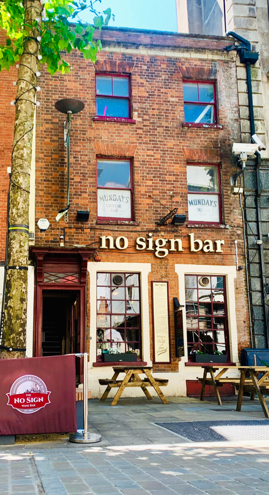
No Sign Wine Bar exterior and branding
The Story
The No Sign Wine Bar is a well known Swansea stalwart, having been a wine merchants or bar since way back in 1690.
The existing logo only dated back to 2012 but was dark, dated and a surprisingly large file being chock full of gradients. Having previously worked with No Sign to brighten it up a little several years before, the closedown in 2020 offered the perfect time to produce a real updated look.
The No Sign Wine Bar is steeped in history and abandoning the feel they had cultivated over years for a full change would not be appropriate but there was definitely the opportunity to bring in a new more contemporary look and fresher colours without losing the warm, welcoming feel the bar is known for.
The Objectives
⬤ New logo, a continuation of the previous format
⬤ Emphasis on No Sign bar being a wholly independent venue
⬤ Specified font for the venue to use on all literature
⬤ Core colour set
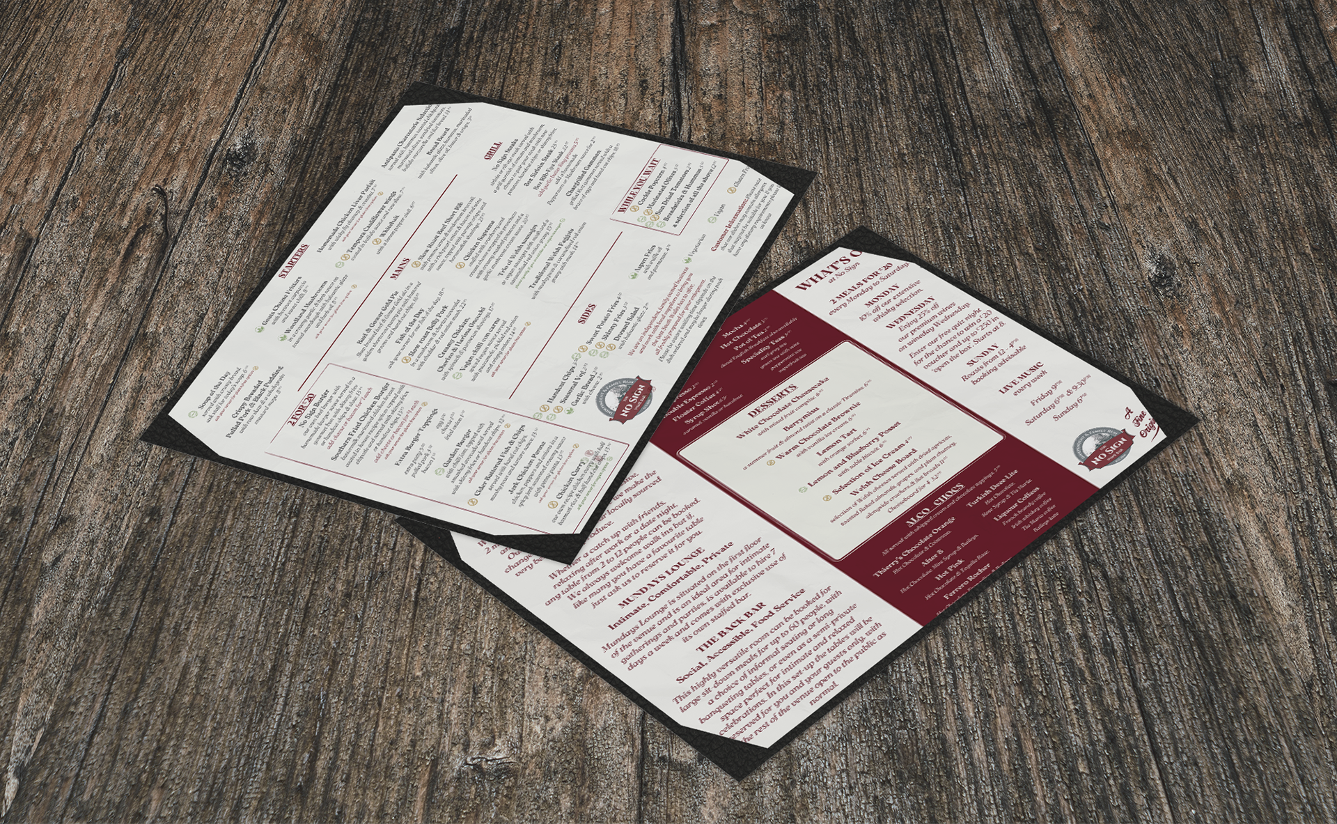
⬤ New menus and posters for the bar
The Result
The bar has a cosy, traditional feel and there was a definite need for continuity with any redesign, so updating the colours and aesthetic without losing the traditional feel was important.
A deep red is used prominently throughout the building, this has been kept as the core colour, both on the logo and typeface.
The venue has quite an extensive menu, printed on cream coloured paper, that much they wanted to keep. So the menu has been kept simple with some iterations including small illustrations for a splash of colour.
Other promotional material use a brighter mix of artwork and photography, often blending the two and incorporating more colour.
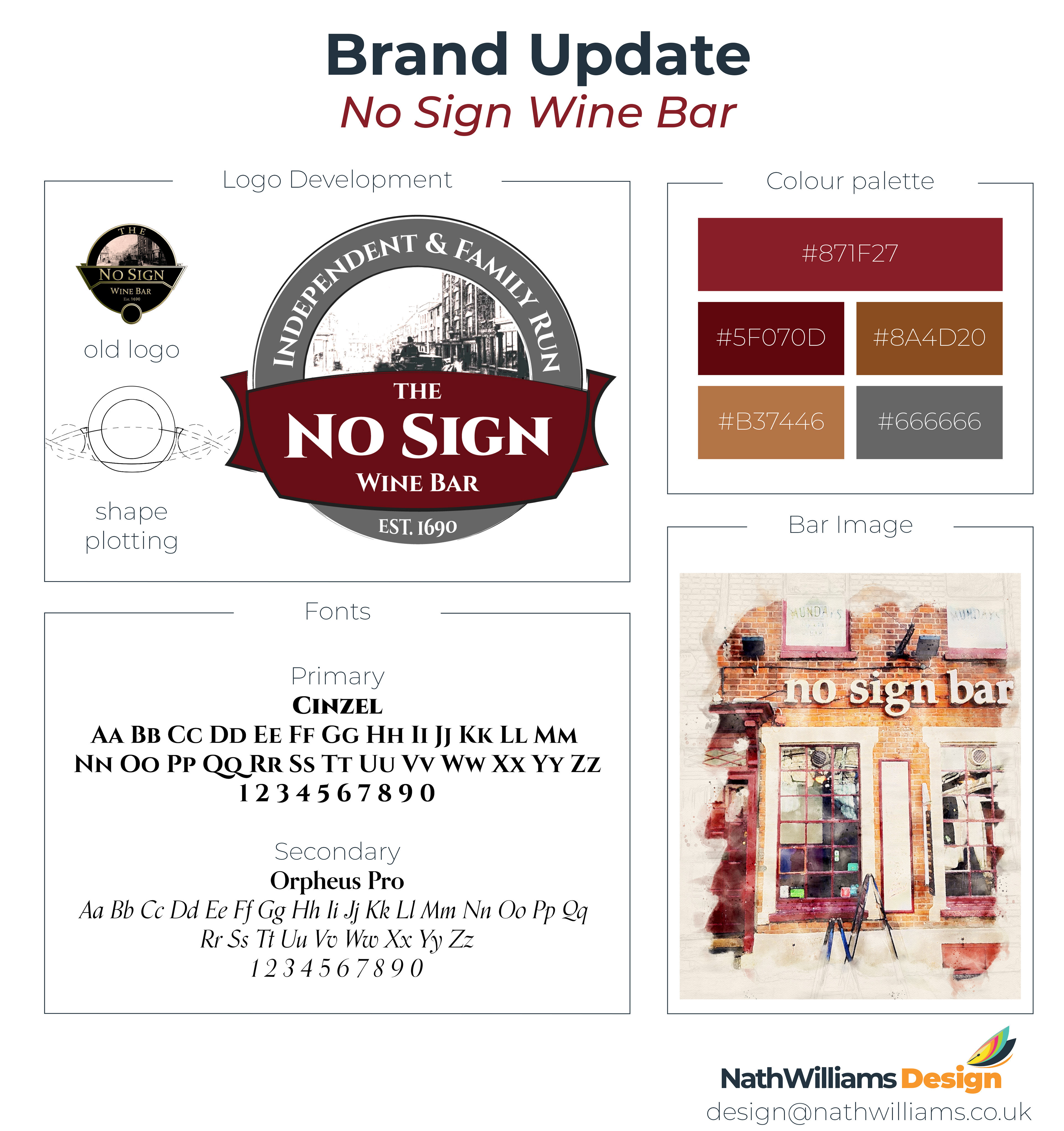
No Sign Wine Bar updated logo development
No Sign Bar Summer 2026 Menu & Events
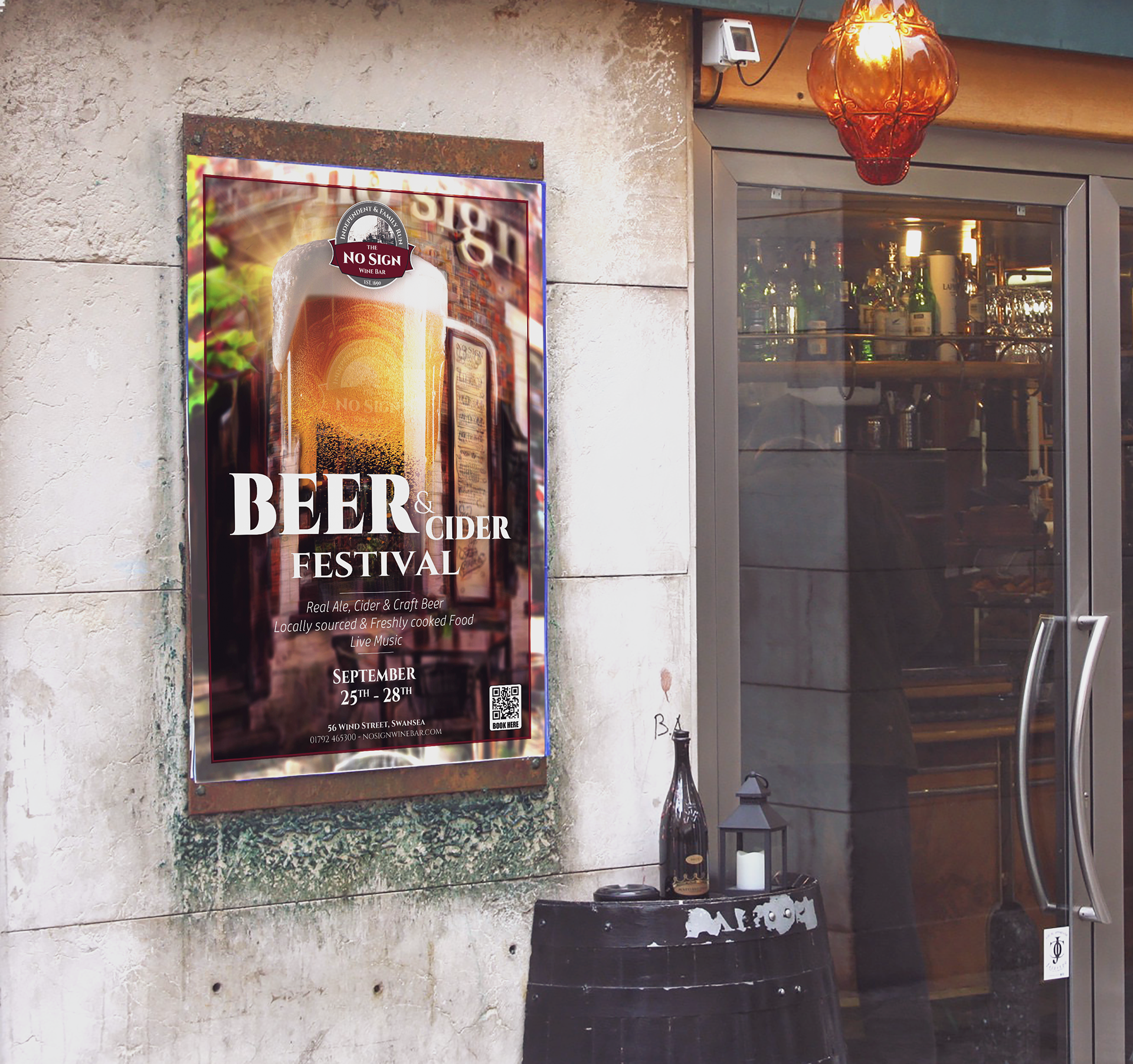
No Sign Bar Beer & Cider Festival poster